
*Not a sponsored post.
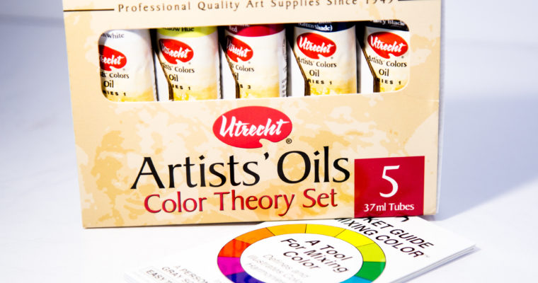
I’ve always heard good things about Utrecht products but hadn’t ever used them myself aside from a few brushes I got years ago. Since I recently sold a few paintings, I wanted to finally replace all of my remaining student grade paints with artist grade paints and decided to give these paints a try. The Color Theory set is what I ultimately bought because I know I use and like most of the colors already. Included in the package is Titanium White (PW 6,PW 4), Zinc Yellow Hue (PY 3, PW 4), Quinacridone Red (PV 19), Phthalo Blue (PB 15Gs), and Ivory Black (PBk 9). All of the colors have a lightfastness rating of 1 except for the Zinc Yellow Hue which has a lightfastness rating of 2. The only color I was unsure about from the get-go was the Zinc Yellow Hue.

The paints came well packaged and without any leaks from my favorite art store DickBlick.com. A small color chart was included in the package which is a nice touch, but I didn’t use it. My first impression with paint straight out of the tube was all of the colors appear to have a nice thick buttery consistency and no excess oil seepage. Most of the colors have good pigmentation although the yellow has very weak tinting strength and the red has only moderate strength. However, I think the red’s moderate tinting strength is a characteristic of the Quinacridone Red pigment. I have some from another brand that has roughly the same tinting strength. I’m satisfied with all of the paints except the Titanium White and Zinc Yellow Hue.
The yellow is a hue which typically means it is a mix of two or more pigments. In the case of the Zinc Yellow Hue, it is a mix of Arylide Yellow 10G (PY 3) and Zinc White (PW 4). It contains a fair amount of zinc white, which proved to be problematic in general color mixing. I don’t know if it’s the white or what, but the yellow had a pretty weak tinting strength. I had to use a ton of it to get any sort of result, which also meant a lot of white in each mix. The white led to a semi-pastel look to many of my mixes which I didn’t particularly like. As the only yellow in this set, I’m disappointed. If I didn’t know better, I would think the difficulty in color mixing was just my own inexperience and be endlessly frustrated.

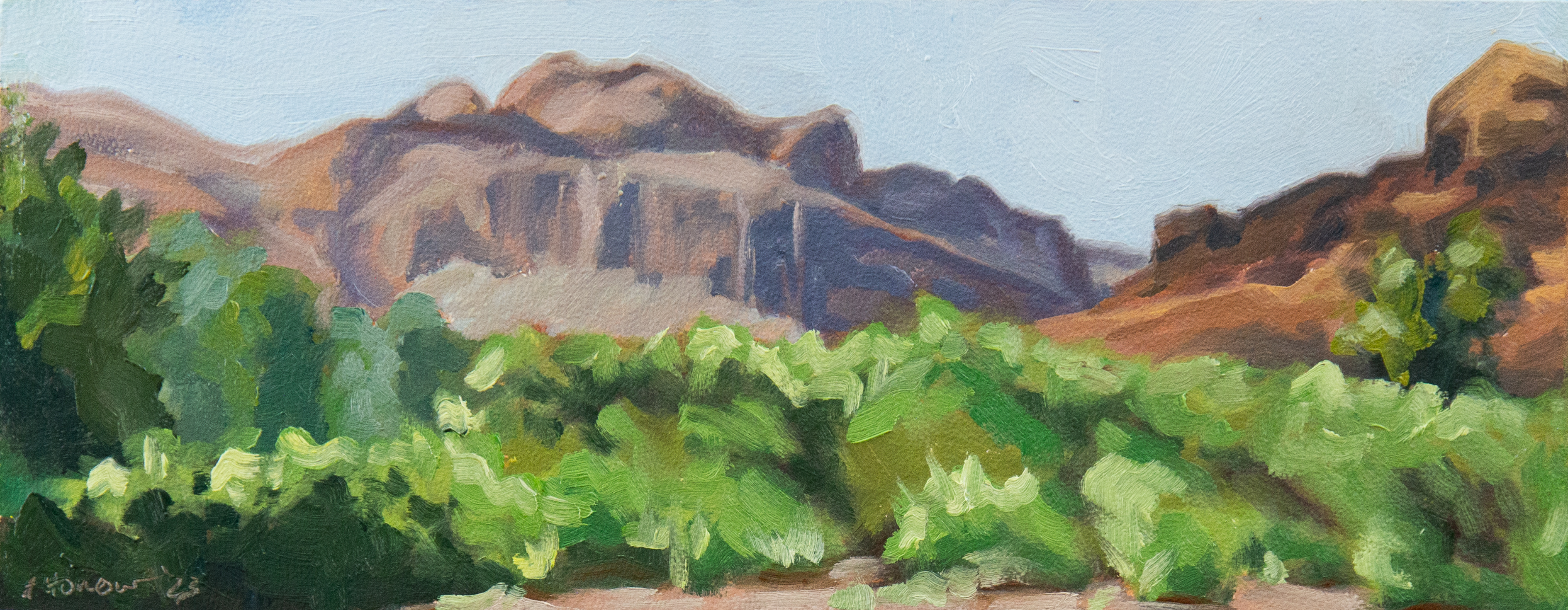
In order to get a really good feel for these paints I painted 30 landscapes using only the paints in this set. Painting as many landscapes as I did, it comes as no surprise that I did a lot of mixing. My main colors in these landscapes consisted of muted green, muted orange, and muted purple. As you can guess, each mix contained yellow. As a result, I had a lot of issues with all of my mixes looking slightly pastel.

Because of the extremely weak tinting strength of the yellow, it was really easy to overdo it with the red, blue or black and end up mixing more paint than I intended. This was less of an issue as I got used to the colors, but was very frustrating in the beginning. I was putting out a new glob of yellow once or twice for each 6×8 painting, which is significantly more than I used of any other color. I only put the other colors out every so often. One good thing of using so much yellow is that I used up a lot of it. I don’t see myself using this yellow again so I’m glad I was able to use up so much of it with this project.
It’s hard to say how much white I used since it’s in different packaging now, but I did use quite a bit. I use a lot of white anyway, which is why I typically buy the larger 150 ml tubes. The next most used color was the Quinacridone red because it only has a medium tint strength. You can see that I barely used any compared to the yellow though. Next up is probably black. I used a lot of black to make greens. I actually barely used any Phthalo Blue. It kept drying on my palette before I could use it up so I had to keep putting it out.
I used so much yellow, white, and red that I didn’t notice if they dried fast on the palette or not, but it did seem like the blue and black dried faster than they should. I’m used to Ivory Black taking forever to dry and lasting for a very long time on my palette. It seemed like the Phthalo Blue and Ivory Black dried at about the same rate. This consistent drying rate may be desirable for some, but I’m used to the different drying rates of different pigments. Since I like to leave paint on my palette between sessions, I prefer paints with longer open time.

And then the white. Initially, I was satisfied with the white. It was like any Titanium white, although a little on the thick side. The more I used it, however, the more I came to despise it. The white was so bad that the yellow issue paled in comparison. Initially I tried to thin this white down with medium in order to load it on my brush and even then it was excessively difficult to handle. It just wanted to spread out on my palette in one thick layer. Then, once I finally did get some paint on my brush, it came off in a very thick layer that blended horribly on the canvas.
I used the paint as is for 2 paintings, but on the third one, which happened to be a snowy winter scene, I was ready to toss it in the trash. It was so thick/dry, that I suspected there just wasn’t enough oil mixed in. Adding linseed oil to it fixed the issue and it was just like using normal Titanium White. For several paintings after, I mixed linseed oil into the white each time I put more out on the palette. Eventually, I bought an empty tube and mixed linseed oil into all of the white at once. I added roughly a teaspoon of oil to the paint and it really made all the difference in the world.

I didn’t find any negative reviews about Utrecht paints when I searched, except for a brief mention by Carol Marine about there being quality control issues and switching to Gamblin. Lucky me, to have had the privlidge to experience one of these quality control issues on my first try. I’m just glad it was a fixable issue and not a lack of pigment like I experienced with Master’s Touch.
Because of the Zinc Yellow Hue, I don’t recommend this set. Because of the quality control issues, I don’t recommend this brand of paint. A non-hue Yellow is $10 more, but the quality difference is worth it. This is especially important if you are struggling with color mixing since single pigment colors are much easier to mix than hues. This being a Color Theory set, Utrecht should have definitely included a better yellow. Although I suspect the reasoning was to market this set at a lower price point to make it more appealing. Since you don’t save any money buying these as a set, you might as well just buy all of these colors separately, and avoid the hue.

I really wanted to love this brand of paint, especially since I’ve heard so many rave reviews and the claim that many professional artists use it. It isn’t horrible paint (aside from quality control issues), but I wasn’t impressed. The major issue with the white and including a hue in a color theory set… really detracted from my experience. It sounds as though there have been quality control issues for years and to expereince it the very first time I try their paints makes me think it is more than an occasional problem. Painting is hard enough when your supplies are perfect. It can be a nightmare when your paints are bad.
I will use up the paints I have except for the Zinc Yellow Hue, but I won’t be buying any more paint from Utrecht. Wasting time being frustrated and trying to figure out why my paint isn’t working is more effort that it’s worth.

As far as colors go, using a limited palette is an excellent way to get better at color mixing. If I were to use this limited palette in the long term, I would definitely replace the Zinc Yellow Hue with Cadmium Yellow, add Burnt Umber and Phthalo Green, and possibly remove the black. With a quality yellow all colors can be more easily mixed, including black. I really like using Burnt Umber for my sketching and I love some of the color mixes I get with it. I also love the versatility of Phthalo Green. You can get both beautiful muted greens as well as really bright, vibrant greens from it.
Keep in mind that Phthalo colors are extremely powerful and may not be the best choice for beginners. A little bit goes a very long way. To build your own color theory palette, I recommend the following colors:
- Titanium White
- Cadmium Yellow or Lemon Yellow
- Quinacridone Red
- Phthalo Blue (Green Shade) or Ultramarine Blue
- Ivory Black (optional)
For a more diverse split primary palette consisting of warm and cool versions of each primary I recommend getting all of the colors above plus Permanent Alizarin Crimson or Permanent Madder Deep.
Leave a Reply