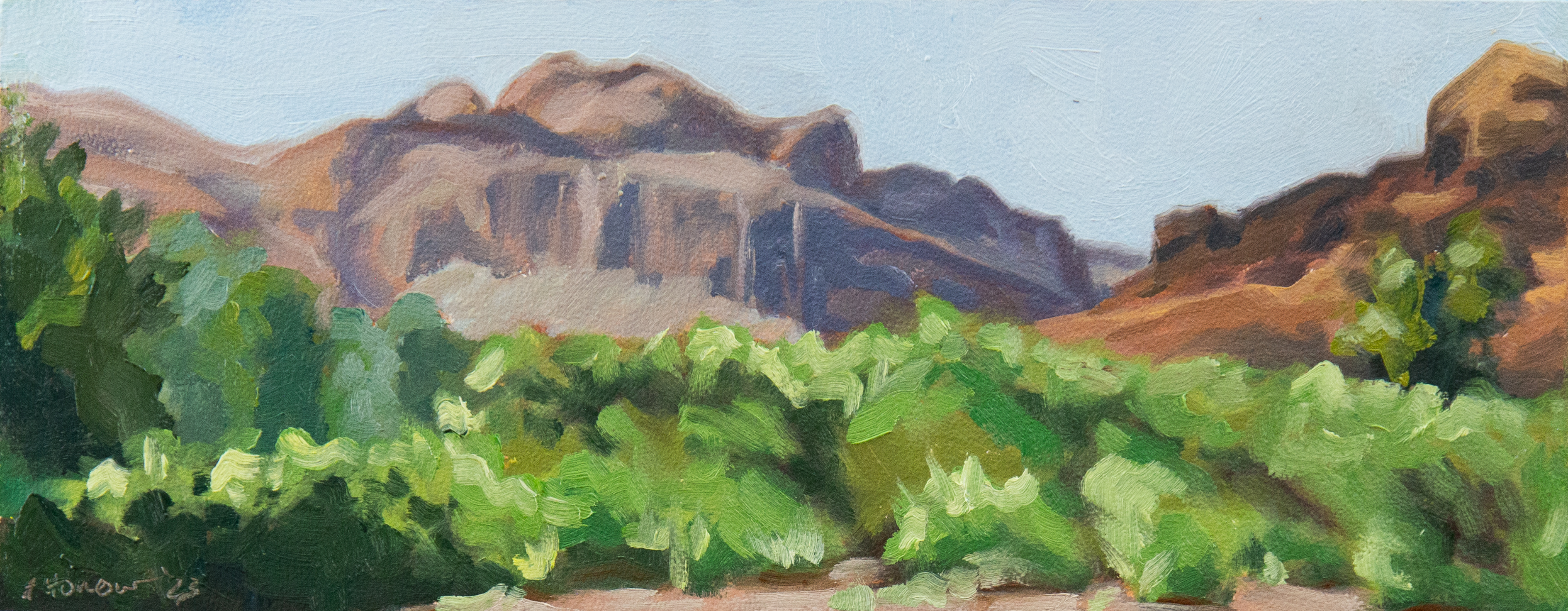
What you think and what is are not always the same.
I started mixing up light oranges to paint this orange, and very quickly realized that this orange isn’t orange. Then I started mixing a yellow with only the slightest hint of orange and got closer. Cadmium Yellow, the only yellow on my palette, wasn’t quite right for the job though.
So I went digging around in my paint drawer and found a small tube of Lemon Yellow. It came from a beginner set of paints that came with an easel I bought 10 years ago. I had higher quality paint at the time so never bothered to use the kit paints. It so perfectly made the color I was after that I bought a higher quality version to permanently add it to my palette. I’ve needed a different yellow on occasion in the past, but usually made do pretty well with Cadmium Yellow. I’m really excited to experiment with this new color some more. I also picked up Winsor Violet while I was at it and am excited to experiment with that too. I may need to paint some more red onions. 😉

In the last few years I’ve added several colors to my palette. Ivory Black, Permanent Rose, Prussian Blue and now Winsor Lemon and Winsor Violet. I’m considering another blue since I liked the addition of Prussian Blue and I like variety. It isn’t necessary though since I’ve made do with French Ultramarine and Cerulean Blue for years without complaint. I only added Prussian Blue to experiment with. Browsing painting forums pointed me in the direction of Phthalo Blue and I have a sample tube so I’m going to give it a go. Any other suggestions on an additional color?
I’ve also retired a few colors over the years that I really don’t like: Thalo Green, Yellow Ochre, and Burnt Sienna. The number one reason I don’t like these colors is that they are way too over powering and I can’t ever mix the color I’m after with them. Even if the color I need is essentially one of those colors I still don’t use them since it always looks wrong to me. The other reason is that somehow, if any one of them is on my palette, then it’s also all over my hands, arms, apron, table… It’s bad.
The colors found on an art’s palette are a personal choice. There isn’t really a right or wrong color, just what works for you. Currently on my Palette: Titanium White, Lemon Yellow, Cadmium Yellow, Cadmium Orange, Cadmium Red, Permanent Rose, Alizarin Crimson, Sap Green, Cerulean Blue, Prussian Blue, F. Ultramarine Blue, Winsor Violet, Burnt Umber, Raw Umber, and Ivory Black.
I will remove Cadmium Orange once I run out since I can very easily mix it from Cad Yellow and Cad Red. Sap Green will also likely disappear once it runs out since I find myself mixing green more often than not despite having green pre mixed. I do have a sample of Viridian that I may try, thought I’m not expecting to use it any more than Sap Green.


Leave a Reply