Oil Painting Portrait – Part 2

20160606-IMG_3540


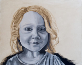
I’m so excited that I sat down and put some work into this painting! The left eye looks ok, but could use more detail. The right eye… just looks odd. There are a few other things that could use more work and I didn’t get the paint as thick as I wanted but I think it’s a pretty good start.

The next session should get a base coat on the hair and background as well as further refinement to the rest of it. I’m just astounded at how quickly I got this far. The detailed underpainting really sped things along.

Read more about this painting and see how it has progressed:

Oil Painting Portrait – Part 1

Oil Painting Portrait – Part 3

Oil Painting Portrait – Part 4
Oil Painting Portrait – Part 5

Oil Painting Portrait – Part 6

5 responses to “Oil Painting Portrait – Part 2”

  1. mdw Avatar

    I like it mulambo…
    It has its own style already.
    Your style.

    I think too many artists go for photographic reality in their sketches and paintings these days.
    But if you look at the works of the past masters they all had their own unique looks and painting styles.

    Nowdays its simply a matter of projecting an image onto a canvas and painting in the colours.
    If you have to ask if its a photo or a painting then for me theres something lost.

    Stay fresh…

    1. mulambo28 Avatar

      Thank you. I’m afraid this painting will likely be pretty realistic when it’s done but it won’t look like a photo. I think my style is pretty tight right now and I’m trying to work on loosening it up.

  2. H. Cedar Keshet Fine Art Avatar

    Your portrait has a great start! I always send photos to my best friend, another artist, and she sends some feed back to me. I find that helpful.
    So here goes a little feed back. The right eye looks because its eye lid is slightly bigger than the left, but that’s not a big problem. I think its the values below the eye. The dark values make the the face, which appears to be a child, look like the eye belongs to an older person. Also the stroke of light color right that runs under the eye is flat while the dark colors are graded, making that light area look on a different plane than the dark. Same for the light area below the dark – the cheek part.
    Perhaps if you make the darks a bit lighter and the light a tiny bit darker toward the nose and keep it about the same as it goes toward the hair and the cheek part, too,….that may make a difference. I’m sure the model has a dark area but some how the dark as it is above makes it look old or bruised and not in keeping with the lovely youthfulness of the rest of the face.
    You’ll get it, your paintings are growing.
    Best of luck,
    Cedar

    1. mulambo28 Avatar

      Thank you for your critique. It’s always good to get advice from fellow artists. I agree that the darks are a bit too dark and the eye really needs more work. I’m pretty inexperienced with portraits so it has been a struggle. Thank you again.

  3. […] so nice having a second set of eyes I can trust to be brutally honest. Check out  Part 1 and  Part 2 to see the progress of this […]

Leave a Reply