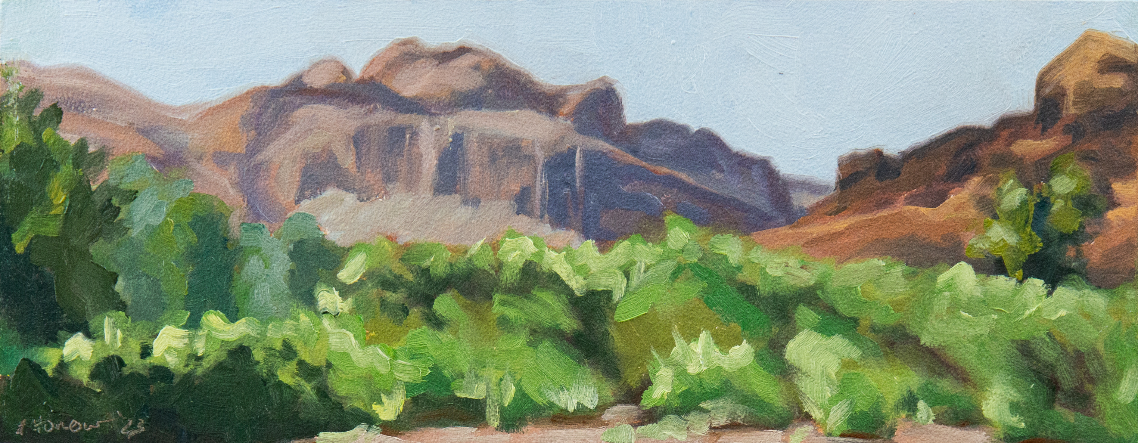
I promise I will get to the review, but first, a new painting and the reason for the review.
This painting is a birthday present for my husband. I’ve never painted anything specifically for him before so I asked him if he was interested. He jumped at the idea and we came up with the idea to paint something he loves. While he appreciates my artwork, he isn’t super interested in food. He is really into guns though.
He was a big help in setting up the still life with me and brought in loads of gear from his police vehicle to use as props. Unfortunately, some pepper balls had broken on some of his stuff a few weeks earlier. As a result, we were both suffering minor effects of pepper spray the entire time. It was not a pleasant experience, but I took a ton of cool reference photos to work from for future projects. Some of them looked like they would be better as large paintings. I thought it would be less intimidating to start with a small one.

Actually painting this went really well aside from one snag. When I got to painting the blue of the flag, I had a really hard time making the paint I had work. A while back I had bought Ultra Blue by Master’s Touch to replace a Grumbacher Academy French Ultramarine that had run out. I apparently hadn’t really used the Ultra Blue until then and was very, very disappointed with it. It was an odd consistency, ultra-transparent, too light to being with, and mixes with it were funky.
I can assure you I’m not being dense. I realize Ultramarine Blue is a transparent color, but this was a whole other level of transparency like there was little to no pigment in the paint type of transparent. I have used a lot of transparent colors over the years including Ultramarine Blue, and this was something else. I had to mix a considerable amount of Prussian Blue and a touch of red into it to get it to a remotely useable state. It was still too thin and… weird. I was so annoyed with that blue that I put the whole painting on hold while I waited on a quality Ultramarine to arrive.
Master’s Touch Oil Paint Review
Master’s Touch is the Hobby Lobby brand of paints and art supplies. They seem to be student grade supplies although they aren’t explicitly labeled one way or another. I decided to give them a try a couple of years ago when I was just getting back into painting and started to run out of my old paints from college.

Most of the colors I used were decent. They have decent tinting strength and good viscosity. However, the French Ultra is complete garbage. It doesn’t have any tinting strength at all, which means I have to use massive gobs of it to get even the slightest color change. The resulting mix is diluted, generally lacking, and essentially useless. Compared to the Grumbacher Pre-tested French Ultramarine, the color is all wrong too. Most notably, it is way too light (probably from too much filler).
As far as oil paint goes, Ultra Blue by Master’s Touch is by far the worst oil paint I’ve ever used. I suppose it could be a bad batch. But if that’s the case, then they have some very serious quality control issues. It’s also possible that this could be a different color. The color names aren’t exactly standard so I chose based on close approximations of the color names I was after. I thought Ultra Blue was short for Ultramarine Blue, but looking at color swatches, it might be close to Cobalt Blue in which case naming it Ultra Blue is misleading. Even if it is in fact supposed to be Cobalt Blue, the ridiculously weak tinting strength and ultra-transparency still make it nearly useless, which leads me back to quality control issues.

I have no complaints with the other colors I’ve used, other than cheap labels that fall off. I’ve had good experiences with Permanent Rose, Prussian Blue, Carbon Black, and Titanium White. I have a few other colors that I don’t use much, and can’t give a definite opinion on. Although, since several of the colors were new to me, I wonder if an artist grade version of the same color would put them to shame.
While not entirely bad, my mixed experience with this brand of paints has been the final straw in deciding to make the switch to artist grade paints. I also think I’ve finally reached the point where the level of art I produce should be created with higher quality paints. Those tiny tubes seem to last forever anyway, so in the end the expense is still low.
As far as student grade oil paint goes, Master’s Touch is ok, but I don’t recommend it. I can just imagine the immense frustration a new painter would experience with this paint. If a person wasn’t sure of how good paint behaves, how could they know it’s the paint and not their skill behind their frustration. A lot of people struggle with color mixing to begin with. Why add to the difficulty with questionable paint?
If you’re set on student grade, go for a better brand. I’ve had some really good experiences with Grumbacher Academy oil paints and highly recommend them. When I looked, they were actually cheaper too. I’m still using a few colors I bought way back in 2005 and don’t have any complaints with them even directly compared and mixed with artist grade paints.
When I looked for reviews online, I didn’t find much on Master’s Touch oil paints. Anyone else out there used them? What did you think? Let me know in the comments.
*This review is of paints that I bought with my own money and this post has not been sponsored in any way.


Leave a Reply