Fourth Yellow Onion & Why I Decided to Stop Using Alizarin Crimson

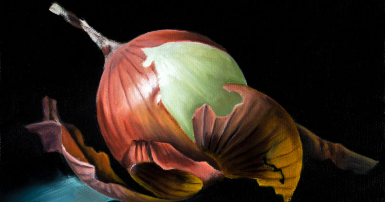
8×8 oil on canvas “Brown Beauty”


There isn’t much to say about this painting. It’s the 4th of 9 yellow onion paintings I’m working on. It didn’t give me much trouble, but most of my paintings lately haven’t. I think I’ve officially reached a point where I can quickly and easily knock out a small still life painting. That can only mean I need to up the ante and try something more challenging. I was thinking I would start out by doing a large still life since I’m comfortable with the subject and then once I feel ok doing a large painting I will change-up my subject.


The Problem with Alizarin Crimson (PR83)


Winsor & Newton Alizarin Crimson (PR83)


Call me naive, but I had no clue alizarin crimson was a fugitive color until last week (even though the tube is clearly marked as “Permanence B”). Or even what a fugitive color was. A fugitive color is one that fades, btw.

This is the second major issue I’ve had with this color over my years of painting. The first was the complete inability to mix a clean purple. That led me down the color rabbit hole I suppose. It opened my eyes to color temperatures and dirty colors. I’m embarrassed to admit that it hadn’t occurred to me before that a red could be anything but warm and the idea that a color from the tube could be “dirty” was silly. But try mixing a purple with a red that contains yellow and you’re setting yourself up for some frustration. I wasn’t blind to the issues, but I didn’t know that was what I was doing and I was missing some key information. Now that I’m more aware of the properties of my colors, I’m far more successful at mixing the color I’m after.

I really wish I would’ve looked into color theory sooner. I thought it was all about primary, secondary, etc colors. I knew basic color mixing, but didn’t realize there was a whole other level to it. It’s that other level that no one seems to talk about, but is vitally important to precise color mixing.


Rembrandt Permanent Madder Deep (PR264): My first experience with the Rembrandt brand. It seems pretty nice, but I haven’t used it much yet. Although it is close, it isn’t an exact replica of Alizarin Crimson. I’m sure I’ll adjust easily enough though.


Anyway, what brought all this up was a YouTube video I came across by Walcott fine Arts. In his video about reds, he said he never uses Alizarin Crimson, which I thought was odd. He explained that it isn’t light fast and recommended to substitute it for Permanent Madder Deep by Rembrandt. I did more research, and sure enough, it’s a very well documented fader. I scraped the Alizarin crimson off my palette that night and order the substitute he recommended. It just made sense to abandon it.

What bothers me is that I’ve been using this color for years. It was recommended to me by my first oil painting teacher in college so I bought it. No disclaimers about how it wouldn’t last or make ugly purples. Ugh college. Other than a bare bones introduction to oil painting, which I’m grateful for, I could really have used some more useful education than what I received. Nowhere, was there a class on color theory, business, building/prepping canvas, etc. Things that I actually would need. Instead, I spent countless class hours drawing perspective lines and ellipses. Seriously, I learned that stuff in elementary school.

Anyway, I hope I opened some eyes to the disadvantages of Alizarin Crimson (specifically pigment #PR83). If you’re already using a permanent version, great! If not, I suggest switching to a permanent version because I’m sure your art is awesome and it would really suck to see it fade with time.



8 responses to “Fourth Yellow Onion & Why I Decided to Stop Using Alizarin Crimson”

  1. Laurie Carlson Avatar
    Laurie Carlson

    Interesting topic. I was told by one online instructor to substitute magenta for alizarin. Or, Permanent Rose. I do like Permanent Rose. I wondered why I really didn’t like using Alizarin. Also, another online painter suggests napthol red and napthol scarlet — saying they are safer to use (not toxic) than the cadmiums. Thank you for sharing your explorations!

    1. Amber Avatar
      Amber

      Permanent rose is probably my favorite red because it’s relatively neutral and therefore versatile, but I really like having a warm and cool red on my palette too. My favorite warm red is a cadmium and my new cool red is the permanent madder deep.They make mixing certain colors a lot easier.

  2. simply painting Avatar

    Really interesting. I’ve also been experimenting with a lot of color mixing and color harmonies. I hadn’t heard this before. Thanks for sharing.

    1. Amber Avatar
      Amber

      You’re welcome. Glad I was able to help.

  3. kingbirdgraphica Avatar

    This is even more of an issue with watercolor. PR83 tends to last longer with oils and acrylics if it’s a high quality version of the pigment – or so I’ve heard. The thicker medium supposedly gives the pigment some protection from the light. In watercolor PR83 usually fades pretty rapidly in tests I’ve run. I don’t know if this pigment is available in oils, but Perylene Maroon (PR179) makes a good substitute for the darker, duller mixing qualities of Alizarin. Otherwise I use Permanent Rose or Quinacridone Magenta (PR122), etc. Mixes made to closely imitate the look and character of Alizarin, and sold as “permanent,” often aren’t much better, it turns out. Buyer beware. Thanks for bringing this up, a lot of great painters are still using Alizarin…

  4. Amber Avatar
    Amber

    Buyer definitely beware. I still see tons of painters still recommending it, which is a pity since there are better options out there. I’ve been really happy with Permanent Madder Deep as a replacement along side Permanent Rose and Cadmium Red Light. I mentioned before that it isn’t an exact match, but I haven’t missed it for a second.

  5. JT Grant Avatar
    JT Grant

    My two favorite colors in school were sap green and alizarin crimson, two of the most fugitive colors you can use. There is a sable brown from seething hot to chilly darkness that cant be fully matched with any other blends. Sigh. It as fun while it lasted. Unfortunately there is no “permanent” alizarin. They are all more or less fugitive. Also quinacridones are dyes, not mineral or stable chemical bases and are therefore also fugitive. Sigh again. I’ve seen paintings, portraits worked with them all. It’s horrifying. The varying blend layers turn to dead greys and have odd opacities and transparencies. The subjects ended up looking like portraits of Dorian Gray, malformed and grotesque…and both portraits’ artists were still alive! (I gently refused to be the sacrificial lamb hired to “fix” them!) I want mine to look as fixed and intentional when they clean them in 400years as they look in the studio tonight. It’s a pain to sift through, lightfastness, but as they say, the truth is out there.

    1. Amber Avatar
      Amber

      Funny that you stay those were your two favorite colors. They were actually my least favorite colors and the first to be dropped. Reds are a pain. I’m not a portrait painter and prefer very saturated modern colors so cadmiums and earth tones are too warm for my general painting style. What is your go to red?

Leave a Reply